Ceilidh Promo
Promotional Material / Graphic Design / Posters
The Gaylidh project unites our city's diverse communities through a fun celebration of traditional Ceilidh dances, combined with the energy and inclusivity of the LGBTQIA+ scene. This vibrant collaboration between Robert Gordon University's LGBTQIA+ network, Aberdeen University's LGBTQ+ Forum, the Granite Gays, and Four Pillars aims to create a space for joyful celebration and inclusivity within the LGBTQIA+ community.
As part of this effort, I designed eye-catching visuals and social media buzz to bring the Gaylidh to life. The evet was a huge sucess, with 120 atendees we managed to donated £800 for charity.
{ the challenge }
How can I craft a cohesive promotional campaign for the Queer Ceilidh that utilizing various mediums and platforms to engage the audience and build excitement on a budget?
{ process }
01
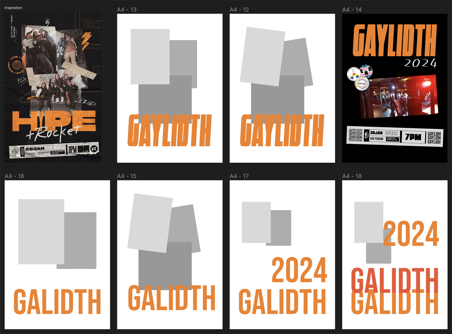
Establish striking visuals that resonate across online and physical platforms, capturing the vibrant energy and inclusive spirit of the Queer Ceilidh. This distinct visual identity will break through event promotion clutter and attract a diverse audience. Starting off with a Poster with elements that can be utilised for various other materials like Instagram posts and stickers.
* its actually gaylidh but at this point of the project I didnt realise the spelling being off *


Striking a balance between captivating visuals and essential information was key for the Gaylidh poster design. I harnessed the vibrant energy of the event through a dynamic flow of bold orange elements, evoking the circular movements of the Ceilidh dances and guiding the viewer's eye towards key details. Opting for a unique colour palette that transcended the traditional rainbow hues, I established a distinctive and eye-catching visual language that stands out from other student Orgamised Network Events.
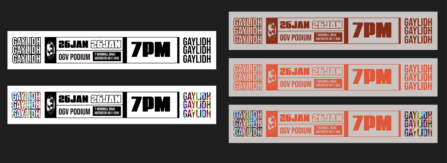
I repurposed an element from the initial design concept into eye-catching stickers. Replacing traditional flyers, these stickers offered a sustainable and engaging alternative, while conveniently providing all the necessary event information in a user-friendly format.

{ process }
02
Consistency Across Platforms: Translating the established visual design from the poster, I ensured a cohesive and memorable experience across platforms, including eye-catching Instagram squares, engaging stories, and stickers.
{ Adding a Touch of Sparkle }
In collaboration with fellow committee member and illustrator Milla Markussen, we wanted to make the poster more dynamic and engage viewers by incorporating playful sparkle elements. Milla generously provided additional elements to complement the design.
{ Refining the Design }
In collaboration with fellow committee member and illustrator Milla's suggestions on strategic positioning and distinctive colours for the newly added graphic elements brought the design to life. This made sure they didn't get lost in the background but instead functioned as unique and eye-catching components, enhancing the overall design.
{ Building Buzz & Beyond }
03
Implementing the established visual style, I designed a dedicated announcement for the crafting session. Balancing differentiation and cohesion was key. I kept the event's typography but introduced new illustrations ensuring the post grabbed attention without blending in with other materials.
{ Uni-Versal Design }
A valuable lesson: university printers varied greatly in quality but professional prints are out of quetsion. Recognising budget constraints, I prioritised adaptability, ensuring the design held up even with potential colour differences across different printers used by partner networks and charities. This strategic choice helped ensure the event's key message remained clear and impactful, regardless of printer interpretations.
Where Tradition
Meets Diversity
-
Gaylidh Promotion
Looking back, the Gaylidh promotional campaign exceeded expectations. The cohesive visual identity resonated across platforms, generating significant buzz and attracting a diverse audience. I learned the value of adaptability in design, ensuring the message reached everyone regardless of budget constraints. This project served as a rewarding experience, fostering community engagement and celebrating inclusivity.